Mobile • Feature Design • 2025
Spotify Loop
Adding micro-looping to music listening — loop specific song segments natively within Spotify.
Role
Product Designer
UX Researcher
Timeline
1 week
Concept to prototype
Team
Solo Project
Self-initiated
Skills
UX Research
Interaction Design
Prototyping
Overview
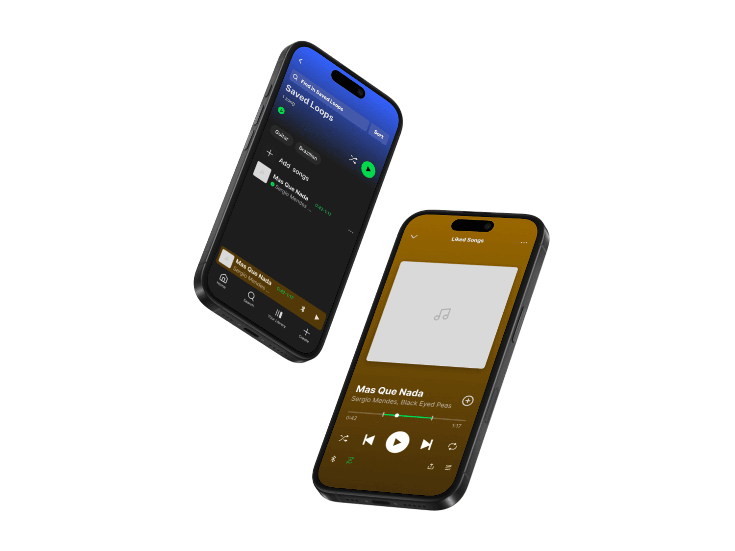
Spotify Loop adds native segment looping to Spotify. Set start and end points, replay that moment on repeat.
Perfect for learning lyrics, practicing instruments, or simply enjoying your favorite parts of a song. This exploratory UX case study focuses on enhancing user interaction for listeners who obsess over hooks, breakdowns, and instrumental sections.
Problem
Spotify lacks a native way to loop specific song segments. Users must rely on external tools or scrub the progress bar imprecisely.
No native segment looping
Users leave Spotify for external tools like PractAid or Moises.ai, breaking flow.
Imprecise scrubbing
Manually scrubbing back and forth is tedious and inaccurate, especially on mobile.
Fragmented experience
App-switching disrupts listening and requires managing multiple tools.
"I love the drop at 1:42 — I wish I could just stay there."
— User research insight
Research
I analyzed Reddit communities, external research, and competitive tools to validate the opportunity.
User Communities
- r/guitar: "It's a pain moving the slider over and over..."
- r/LearnGuitar: Developers created tools like PractAid because "there's no feature"
- r/spotify: "I'll literally listen to it on loop the entire day"
Market Signals
- • 68% of musicians 16–34 use streaming to practice (YouGov)
- • 41% need extra tools for segment replay
- • Moises.ai and AudioStretch have millions of users
- • YouTube Looper: 500K+ weekly users
Key Insight
Integration gap — No reviewed tools work natively inside Spotify's mobile player, forcing app-switching or desktop-only workflows.
User Journey
Mapping emotional pain points and moments of opportunity.

Solution
Tap-to-loop: tap once to set start, tap again to set end. Loop controls sit next to the Bluetooth button on the main player, with an additional entry point in the ellipses action menu.
User Flow

Set Loop Points
Tap timeline to set start → Tap again to set end → Loop activates
Play & Adjust
Segment plays on repeat → Drag handles to adjust → Tap icon to disable
Save & Access
Save loops to library → Access in "Looped Segments" tab
Design Principles
Respect the music: Full tracks always accessible, looping is additive.
Minimal UI: Loop icon placed alongside existing controls, preserving Spotify's clean interface.
Empower interaction: Let users linger on moments that move them.
Design Process
From low-fidelity wireframes to polished prototypes.
Lo-Fi Prototype
Testing loop creation, visual feedback, and control placement.

Testing Insights
- • Tap-to-set preferred over drag for precision
- • Subtle highlight band best for showing looped segment
- • Placing loop icon next to Bluetooth button maximized discoverability
High-Fidelity Prototypes
Polished designs ready for user testing.


Design Decisions
Key decisions that shaped the feature.
Why tap-to-set instead of waveform selection?
Waveforms are powerful but complex. Tap-to-set mirrors the familiar progress bar interaction users already know. It's simple, scalable, and works on small mobile screens.
Why place it next to the Bluetooth button?
The main player row has established real estate for quick actions. Placing the loop icon here makes it immediately visible without adding UI complexity. The ellipses menu provides an alternative entry point for users who prefer that flow.
Why include a saved loops library?
Users develop favorites — the same drop, the same chorus. Saving loops turns a feature into a personalized listening experience tied to their music identity.
Why not show waveforms by default?
Waveforms add visual complexity that casual listeners don't need. The highlight band is enough to communicate the looped segment without cluttering album art.
Design Highlights
2 taps
To create a loop
0 menus
Direct timeline interaction
2 entry points
Main player + ellipses menu
Learnings
What this project taught me.
01 Micro-interactions matter
Small features that feel obvious once they exist can significantly enhance user delight. The best additions feel native, not bolted on.
02 Respect existing patterns
Spotify has a design language. Any new feature must harmonize with it, not fight it. Placing the loop icon in the main control row mirrors how Spotify handles other quick actions.
03 Zoom in to find opportunities
Finding overlooked behaviors and building features that feel obvious once they exist creates real value. Spotify Loop emerged from observing what people already try to do.
Next Steps
Saving loops as mini-bookmarks tied to tracks
Sharing loops with visual/audio snippets
Creating playlists of favorite segments
Adding loop insights to Wrapped ("Your most-looped moments")
Final Thoughts
Spotify Loop might seem like a small tweak, but it aligns with evolving user behavior. From TikTok loops to study playlists, people want music to be modular, not just linear.
This project taught me the value of zooming in: finding overlooked behaviors and building features that feel obvious once they exist. Looping gives users more expressive power in how they listen, learn, and love their favorite tracks.